Fonts
Typography is an essential part of the AEMO visual system. When used consistently, it unifies messaging and creates familiarity.
Good typography not only differentiates a brand but also communicates the brand’s style, personality and tone of voice. It has a huge influence on brand perception and recognition.
Our default typeface has been chosen to maximise legibility across a number of font sizes and to ensure we have clear, consistent headings, paragraphs and form elements.
Read more  brand guideline on MO
Primary font
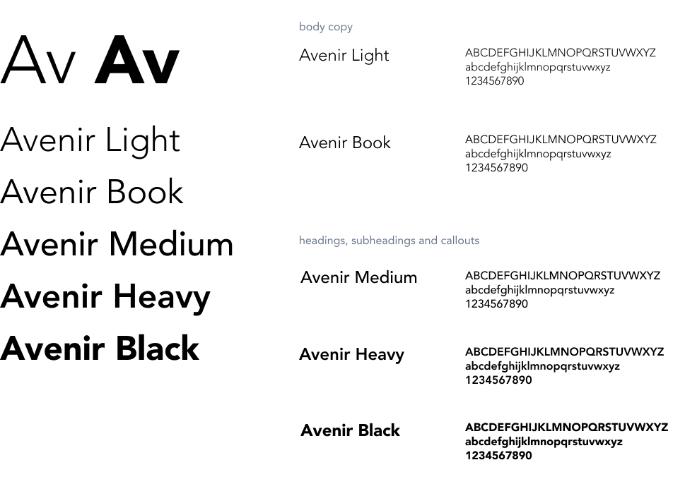
Avenir typeface
A well known, versatile, and professional typeface that has been used in a varying number of weights to create a sense of control and contrast.
Avenir is the primary font. AEMO communications should use Avenir, including all body copy and headings.
The typeface is made up of multiple weights: Light, Book, Medium, Heavy, and Black. Italicised versions are also included in the family.
The default weight to use is Avenir Light for body copy and Avenir Heavy or Black for headings.
The supporting weights of Avenir may also be used, but usually for emphasis in smaller applications such as captions, tables, charts, and diagrams.
Title and sentence case are preferred. Only use all caps in small instances such as charts, labels, and UI navigation. Avoid adding outlines, drop shadows or other effects to type
Download font files
Alternative fonts
In cases where Avenir is not available, alternative fonts should be used as a substitute. These cases may include digital applications such as HTML emails, internal Microsoft Office templates or digital presentations (such as PowerPoint) that cannot embed fonts. These are system typefaces and are available on both PC and Mac platforms.
Century Gothic and Arial Nova
Century Gothic can also be used for emphasis such as heading, subheads captions, tables, charts, and diagrams.
Arial Nova can be used for body text.
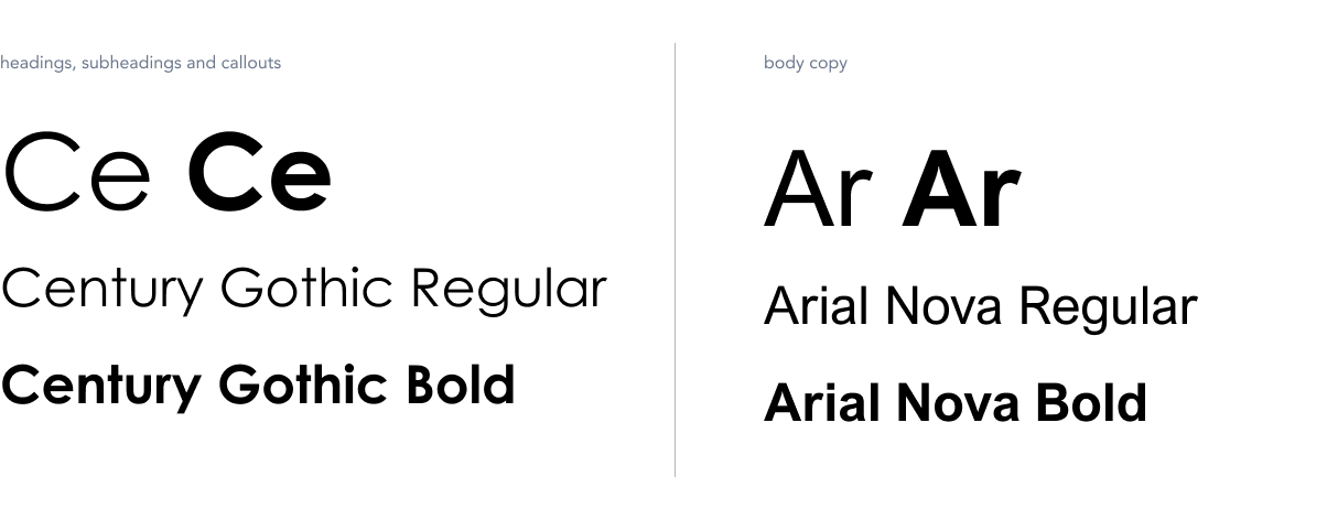
Century Gothic only to be used in MS Office 365 when Avenir is unavailable as the primary font. For web and software development, please follow Typography in Web Development