Dark Mode
Dark mode uses darker, less-saturated colors to create a low-light user interface.

Basic Principles
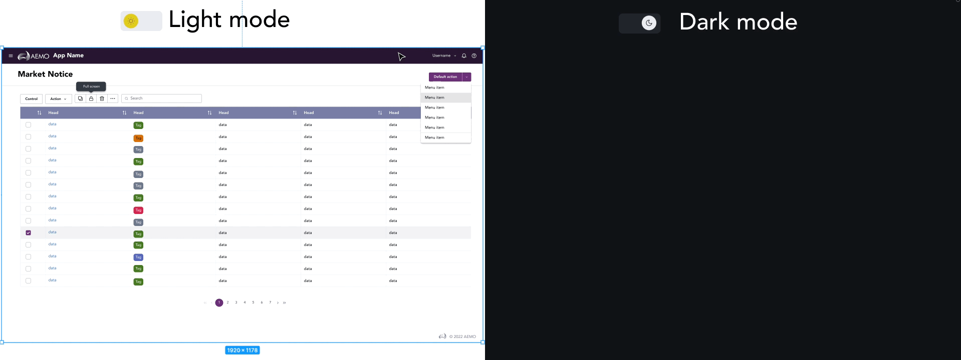
Dark mode is a style variation that can be applied to the GEL Design System default palette. The dark mode palette adjusts colors for low light conditions. It helps many users with eye fatigue and can help with battery conservation on mobile devices. We have developed our dark mode based on principles from Google Material and Apple Human Interface Guidelines, which include these key elements:
- Darken with grays instead of black. This allows for more visual depth and surface separation.
- Large surface areas should use dark colors, mostly dark grays.
- Limit the use of bright, deeply saturated color accents.
How It Works
Dark mode is enabled by our color tokens. These tokens are semantically named style labels that allow for more flexibility and scaling within the system in the future. A single color token is assigned to a fill, border or text color and each token is assigned two distinct values: one for the default style palette and one for the dark mode palette.

Surface Color
Below you can see the default UI surface palette used for the Design System and the corresponding dark mode UI palette. In a dark mode the UI becomes predominantly dark gray.

Surface and Elevation
Often a user interface is sectioned using a combination of surface color and elevation. In default mode, elevation is shown through the use of shadows on an element and uses our elevation tokens. In dark mode, shadows are not as visible and visual elevation is created by adding lighter tranparent overlays onto surfaces that should be a higher elevation.

Demo